
Free educational resource
A five-step checklist for clearer SketchUp presentation images
A strong presentation image begins before rendering. Use this workflow to make the purpose, framing, model state, light, and final comparison intentional.
The 30-second review
Before sharing an image, confirm these six conditions. If one is unclear, fix that before adding more polish.
- One clear purpose
- Deliberate camera and crop
- Clean visible geometry
- Readable lighting hierarchy
- Believable material scale
- Side-by-side final review
Readability before polish
Use the same model to evaluate two layers of communication.
The model view should establish geometry and composition. A visualization pass can then clarify lighting, material intent, and atmosphere without changing the underlying design message.
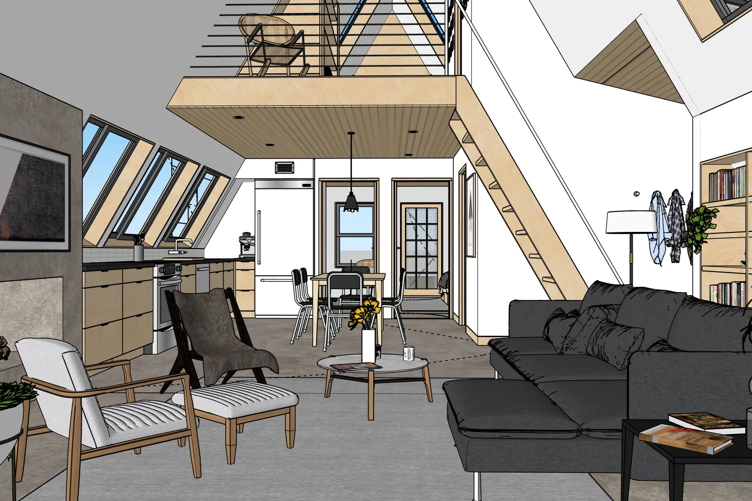

Decide what the image needs to explain
A presentation image works better when it has one job. Choose the decision or idea the viewer should understand before changing the camera or materials.
- Name the primary subject in one short sentence.
- Identify whether the viewer is reviewing layout, scale, atmosphere, materials, or a design option.
- Remove details that compete with that purpose.
Ready when: Someone unfamiliar with the model can tell what they should look at first.
Set the camera and frame before styling
Composition carries more information than surface polish. Establish the eye level, field of view, and crop while the model is still easy to read.
- Use an eye level appropriate to the intended viewer.
- Avoid an unnecessarily wide field of view that stretches walls and furniture.
- Keep important edges away from accidental tangencies with the frame.
- Leave purposeful breathing room around the primary subject.
Ready when: The unrendered SketchUp view already reads as a deliberate composition.
Clean the visible model
A presentation view does not need every object in the project. Control visibility so the image shows enough context without exposing construction clutter.
- Hide guides, temporary geometry, unused entourage, and distracting context.
- Check visible tag states and scene updates before exporting.
- Correct reversed faces, obvious gaps, floating objects, and intersecting geometry.
- Confirm that repeated components use the intended version.
Ready when: Nothing visible looks accidental, unfinished, or unrelated to the message.
Create a clear light and material hierarchy
Materials and lighting should help separate forms. They should not make every surface equally loud or introduce a mood that contradicts the design.
- Choose one dominant light direction and keep shadows understandable.
- Separate adjacent surfaces with value, color, or texture—not all three at maximum intensity.
- Keep material scale believable relative to the model.
- Use accent color where it supports the focal point.
Ready when: The primary form remains readable in both color and grayscale.
Export, compare, and make one purposeful revision
The first export is a review image. Compare it at the size your audience will actually see, then correct the single issue that most weakens the message.
- Review at presentation size rather than only zoomed in.
- Check the brightest highlight, darkest shadow, and most saturated color.
- Compare options side by side instead of relying on memory.
- Save the approved camera and visibility state as a named scene.
Ready when: You can explain why the final version communicates the design more clearly than the first.
Common failure points
Polish cannot rescue an unclear image.
Camera too wide
The room looks larger, furniture stretches, and the viewer loses a natural sense of scale.
Everything visible
Construction context and temporary objects compete with the design being presented.
Every material is loud
Strong texture, color, and reflection on every surface remove visual hierarchy.
No comparison step
The latest image feels finished simply because it is new, not because it communicates better.
Final check
Can the image stand on its own?
Show it briefly to someone who has not been inside the model. Ask what they notice first, what feels unclear, and what decision they think the image supports. Their answer is more useful than another hour of undirected polishing.
This guide is complete as published. No registration, purchase, or additional resource is required.